
SAT Data Analysis – Quick Review
Data
Analysis
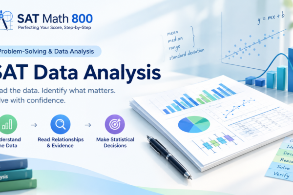
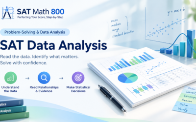
Read the data. See the pattern. Solve the problem.
Master ratios, rates, percentages, statistics, distributions, graphs, models, probability, sampling, and study design—one clear idea at a time.
| Group | Mean |
|---|---|
| A | 72 |
| B | 81 |
| C | 78 |
| D | 86 |
The SAT Data Detective
Start by understanding what the data is saying.
What Is Data Analysis?
SAT Data Analysis questions are not usually about doing complicated mathematics. They are about extracting the right information, choosing the right mathematical idea, and interpreting the result.
What information is shown?
What does it mean?
What must I calculate?
Ratios, Rates & Percentages
Translate quantities into useful relationships.
Ratios: Parts, Groups & Proportions
If red objects and blue objects are in the ratio \(3:5\), there are \(3+5=8\) total parts.
Rates & Units
A rate compares quantities with different units. On the SAT, the units themselves can guide your setup.
Example: A machine produces \(18\) parts per minute. At the same rate, how many parts does it produce in \(5\) minutes?
Percentages: The SAT’s Favorite Language
Percent of a quantity
Percent change
Example: A quantity increases from \(80\) to \(100\).
Understanding Distributions
Mean, median, spread, outliers, and standard deviation.
Mean: The Balance Point
The mean is the arithmetic average, but for SAT problems the most useful relationship is often:
Example: The mean of \(8\) numbers is \(14\). What is their total?
Finding a Missing Value
Suppose the mean of \(8,\ 11,\ 14,\ x\) is \(12\).
Median: The Middle Matters
The median is the middle value after the data are placed in numerical order.
Odd number of values
Median \(=9\).
Even number of values
The two middle values are \(7\) and \(9\).
Mean vs. Median: Outliers Change the Story
The \(80\) is far from the rest of the data. It pulls the mean upward, while the median remains much more stable.
Sensitive to extreme values.
Much less affected by extreme values.
Range & Spread
\(48,\ 49,\ 50,\ 51,\ 52\)
Range: \[ 52-48=4 \]
\(20,\ 35,\ 50,\ 65,\ 80\)
Range: \[ 80-20=60 \]
Both data sets have mean \(50\), but Data B is much more spread out.
Standard Deviation: How Spread Out?
For the SAT, the important idea is interpretation: standard deviation measures how spread out the data are around the mean.
Same mean + wider distribution = larger standard deviation.
Reading Graphs & Tables
Turn visual information into mathematics.
Frequency & Relative Frequency
Frequency tells you how many observations are in a category or interval.
Relative frequency tells you what fraction or percentage of the total that represents.
Example: \(24\) of \(80\) students prefer option A.
Dot Plots: Every Dot Counts
Histograms: Read the Bars Correctly
A histogram groups numerical data into intervals. Each bar represents all observations that fall inside its interval.
Box Plots: The Five-Number Story
A box plot summarizes a distribution with five key values.
25th percentile
50th percentile
75th percentile
Relationships & Models
Scatterplots, trends, predictions, and mathematical models.
Scatterplots: Finding Relationships
Line of Best Fit
A line of best fit describes the overall trend in a scatterplot and can be used to make predictions.
The predicted change in \(y\) for each 1-unit increase in \(x\).
The predicted value of \(y\) when \(x=0\).
Example: A model is \[ y=4.2x+17. \] If \(x\) increases by \(1\), the predicted value of \(y\) increases by \(4.2\).
Predictions: Observed vs. Predicted
Linear, Quadratic & Exponential Models
Constant additive change.
Differences change at a constant rate.
Constant multiplicative change.
Common model forms include:
Probability & Statistical Studies
Probability, samples, margin of error, and evidence.
Probability: The Basic Framework
Example: A bag contains \(5\) blue balls and \(3\) red balls. If one ball is selected at random, the probability of selecting a red ball is:
Conditional Probability: “Given That” Changes the Denominator
The phrase given that tells you to restrict the group you are considering.
| Plays sports | Doesn’t | Total | |
|---|---|---|---|
| Juniors | 30 | 20 | 50 |
| Seniors | 18 | 32 | 50 |
| Total | 48 | 52 | 100 |
Question: What is the probability that a student plays sports given that the student is a senior?
Samples & Populations
Margin of Error
Suppose a poll estimates that \(54\%\) of students prefer option A, with a margin of error of \(\pm3\%\).
The corresponding interval is:
Observational Studies vs. Experiments
Researchers observe subjects without assigning a treatment.
Researchers assign treatments or conditions and measure outcomes.
When subjects are randomly assigned to treatment groups, differences between groups are less likely to be explained by pre-existing characteristics. This provides stronger evidence for a causal relationship.
The SAT Data Analysis Playbook
A repeatable method for unfamiliar questions.
The 5-Step Data Analysis Method
What exactly is the question asking?
What type of problem is this?
Turn words, tables, or graphs into mathematics.
Do only the mathematics you need.
Does the answer make sense in context? Check the units, magnitude, and wording.
The SAT Data Analysis Trap List
One Final Mindset Shift
The SAT does not give you data to overwhelm you.
It gives you data to interpret.
Ready for the Data Analysis Challenge?
Put the ideas into practice with 24 original SAT-style questions across 12 high-value Data Analysis categories.
Ratios · Percentages · Mean · Median · Spread · Tables · Histograms · Box Plots · Scatterplots · Models · Probability · Sampling
Practice Data Analysis →
One thought on “SAT Data Analysis – Quick Review”