

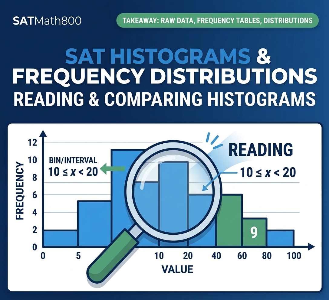
Histograms and Frequency Distributions
SAT Histograms & Frequency Distributions
Reading and Comparing Histograms
Learn to move confidently between raw data, frequency tables, histograms,
intervals, distribution shape, center, spread, and SAT-style conclusions.
1. What a Histogram Actually Shows
A histogram summarizes numerical data by grouping values into intervals, sometimes called bins. Each bar represents the observations that fall inside one interval.
The Four Things to Read First
1. Horizontal axis
What numerical quantity is being grouped?
2. Vertical axis
What does the height represent: frequency, relative frequency, or percent?
3. Interval
Which numerical values belong to this bar?
4. Bar height
How many observations, or what proportion of observations, are represented?
Original SATMath800 example: the bar over 60–70 has frequency 11.
2. Bins and Intervals — The Most Important Reading Skill
A histogram groups numerical values into intervals. The exact meaning of an interval depends on how the problem defines it.
Example of an Interval Definition
Suppose a problem states that the first interval contains integers greater than or equal to 10 but less than 20.
Therefore, 10 is included, while 20 is not.
A histogram has an interval labeled 30–40. The problem states that this interval represents integers greater than or equal to 30 but less than 40. Which value belongs to this interval?
Solution
Answer: B
3. Frequency vs. Relative Frequency
Frequency is a count. It tells you how many observations fall in an interval.
Relative frequency is a proportion or percentage. It tells you what fraction of all observations fall in an interval.
Frequency
If 18 students scored from 70 to 80, the frequency is \(18\).
Relative Frequency
If 18 of 60 students scored from 70 to 80, then
4. How to Read a Histogram Precisely
Use this routine whenever you see a histogram.
Step 1
Read the horizontal axis.
Step 2
Read the vertical axis.
Step 3
Read the interval definition.
Step 4
Read the relevant bar height.
In the histogram from Section 1, how many observations have scores from 60 up to but not including 70?
Solution
Answer: C
5. Finding the Most Common Interval
The interval with the tallest bar has the greatest frequency. This interval is sometimes called the modal interval.
The tallest bar identifies the interval with the greatest frequency.
Which interval contains the greatest number of observations?
Solution
Answer: C
6. Finding the Total Number of Observations
If a histogram shows frequency and all intervals are included, add the bar heights to find the total number of observations.
A histogram has five bars with frequencies \(4,7,9,6,4\). How many observations are in the data set?
Solution
Answer: 30 observations
7. What a Histogram Can Tell You About Center
A histogram can show where observations are concentrated, but grouping the data into intervals may prevent you from finding an exact mean or median.
Mean
The exact average requires the individual values or enough information to reconstruct their total.
Median
The exact middle value may be hidden inside an interval.
Typical location
The histogram can still show where the data are concentrated.
A histogram can make the general location of a distribution visible without revealing every value.
8. Range and Spread from a Histogram
Spread describes how widely the data are distributed. A histogram can show the overall spread, but the exact minimum or maximum may not be visible.
Range
\(\text{Range}=\text{maximum}-\text{minimum}\).
Histogram limitation
If the first occupied interval is 40–50, the exact minimum could be many values within that interval.
A histogram’s first occupied interval is 40–50 and its last occupied interval is 80–90. Can the exact range be determined from the histogram alone?
Solution
Answer: C
9. Comparing Two Histograms
When two histograms are compared, first make sure the horizontal scales and interval definitions are comparable. Then compare concentration, center, spread, and shape.
Center
Where is the data concentrated?
Spread
How wide is the distribution?
Shape
Is it symmetric, skewed, clustered, or separated by gaps?
Frequency
How many observations are in important intervals?
The first question is not “Which looks taller?” It is “What does the shared scale show?”
10. Distribution Shape
A histogram’s shape is the overall pattern formed by its bars. Common descriptions include approximately symmetric, skewed, clustered, and separated by gaps.
Approximately symmetric
The left and right sides have a similar overall pattern around a central region.
Right-skewed
Most observations are relatively lower, with a longer tail extending toward larger values.
Left-skewed
Most observations are relatively higher, with a longer tail extending toward smaller values.
Shape is about the overall pattern, not one individual bar.
11. Histograms and Unusual Values
A histogram may suggest an unusual region when one observation or a small group lies far from the main concentration. But a grouped graph may hide the exact value of that observation.
A separated bar can suggest an unusual region, but grouped data still limit exact conclusions.
12. How to Construct a Histogram from a Set of Numbers
A histogram starts with the raw data. The basic process is simple: choose intervals, count how many values fall in each interval, and draw bars whose heights match those counts.
Original SATMath800 Example
Suppose the data are:
We will use four simple intervals: 10–19, 20–29, 30–39, and 40–49.
Step 1 — Choose the intervals
| Interval | Values that belong | Frequency |
|---|---|---|
| 10–19 | 12, 14, 17 | 3 |
| 20–29 | 21, 22, 24, 27 | 4 |
| 30–39 | 31, 34, 36, 38 | 4 |
| 40–49 | 42 | 1 |
Step 2 — Draw one bar for each interval
The frequencies are 3, 4, 4, and 1, so the histogram contains 12 observations in total.
Why this construction works
13. Frequency Tables → Histograms
A frequency table and a frequency histogram contain the same basic information: the intervals and their counts. The histogram turns the table into a visual pattern.
| Interval | Frequency |
|---|---|
| 0–9 | 3 |
| 10–19 | 6 |
| 20–29 | 8 |
| 30–39 | 5 |
Which interval should have the tallest bar when the table above is represented as a frequency histogram?
Solution
Answer: C
14. Histograms vs. Bar Graphs
Both displays use rectangular bars, but they summarize different kinds of information.
Histogram
- Used for numerical data.
- Values are grouped into intervals.
- Adjacent numerical intervals normally touch.
- Bar height represents frequency or another numerical measure.
Bar Graph
- Often used for categories.
- Each bar represents a category.
- Categories are distinct rather than continuous intervals.
- Gaps commonly separate categories.
15. Changing Bin Width — Why the Picture Can Change
The same raw data can produce different-looking histograms if the interval width changes. The data did not change; the grouping changed.
Different bin widths can make the same distribution look smoother or more detailed.
16. Histograms in SAT Word Problems
In a context question, translate the graph into the language of the situation. The arithmetic is often simple; the reading is the real challenge.
A study records the number of minutes 40 students spend exercising each week. A frequency histogram shows that 14 students exercise from 60 up to but not including 90 minutes. How many students are represented by that interval?
Solution
Answer: A
17. What a Histogram Cannot Tell You Exactly
Grouping information is useful, but it removes some detail. A strong SAT student knows when the graph supports an exact answer and when it does not.
| Question | Usually determined exactly? |
|---|---|
| Which interval has the highest frequency? | Yes |
| Total frequency, if all bars are shown | Yes |
| Exact minimum inside the first occupied interval | Not necessarily |
| Exact maximum inside the last occupied interval | Not necessarily |
| Exact mean from grouped intervals alone | Not necessarily |
| Exact median from grouped intervals alone | Not necessarily |
18. SAT Traps You Should Recognize Instantly
Trap 1: Reading a Bar as a Value
The bar height is usually a frequency or relative frequency, not the numerical value on the horizontal axis.
Trap 2: Ignoring Interval Definitions
Do not automatically include both endpoints. Follow the interval definition given by the problem.
Trap 3: Assuming the Tallest Bar Gives the Mean
The tallest bar identifies the most frequent interval, not the exact mean.
Trap 4: Assuming a Gap Gives an Exact Outlier
A gap shows separation in grouped data; it does not reveal an exact value.
Trap 5: Adding Percentages as Counts
If the axis is percent, convert using the total number of observations before finding a count.
Trap 6: Comparing Heights Without Checking Scales
Before comparing two histograms, verify that their horizontal intervals and vertical scales are comparable.
19. Your SAT Decision Framework
OBSERVE
Read both axes and the interval labels.
IDENTIFY
Decide whether the height is frequency, relative frequency, or percent.
READ
Locate the relevant interval or intervals.
REASON
Add, compare, convert, or interpret only what the graph supports.
VERIFY
Check units, endpoints, totals, and whether your conclusion is exact or approximate.
ANSWER
Choose the statement that matches the graph—not the statement that sounds most sophisticated.
20. Quick Concept Check
1. What does the height of a frequency histogram bar represent?
2. If an interval is \(20 \le x < 30\), is 30 included?
3. What does the tallest bar tell you?
4. Can a histogram always give the exact mean?
5. Why can changing bin width change the appearance of a histogram?
Answers
20. Advanced Practice — SAT-Style Histogram Problems
What makes these questions “advanced”?
The hardest histogram questions are rarely about reading one bar. They combine a histogram with another idea: mean or median, a change to the data set, interval endpoints, possible values, comparison of two distributions, or a statement that must be true.
The questions below are original SATMath800 questions. Their structures are modeled on the kinds of reasoning used in official SAT practice, but the numbers, contexts, data sets, answer choices, and visuals are original.
The histogram summarizes the number of books read by 40 students during a summer. The interval from 4 up to but not including 6 contains 10 students. What percentage of the students read from 4 up to but not including 6 books?
All 40 students are represented by the five bars.
Solution
Answer: C
The histogram represents 41 measurements. Which interval contains the median of the data set?
Solution
Answer: C
The histogram summarizes data set A, which contains 40 values. A new value of 18 is added to data set A to create data set B with 41 values. Which of the following must be true?
Frequencies: 4, 6, 18, and 12. Total = 40.
I. The mean of data set B is less than the mean of data set A.
II. The median of data set B is less than the median of data set A.
Solution
Answer: A
Two data sets of 20 integers each are summarized in the histograms shown. For each histogram, an interval such as 40–50 represents integers greater than or equal to 40 but less than 50. What is the smallest possible difference between the mean of data set A and the mean of data set B?
In both histograms, the four frequencies are 2, 5, 8, and 5.
Solution
Answer: C
A data set contains 30 integers. The histogram shows the distribution of the values. Which of the following could be the mean of the data set?
Solution
Answer: B
The two histograms summarize data sets A and B. Both data sets contain 20 values. Which statement must be true?
Solution
Answer: B
A histogram summarizes 50 observations. The frequencies of the five intervals are 6, 9, 15, 12, and 8, respectively. The intervals are 0–10, 10–20, 20–30, 30–40, and 40–50, where the lower endpoint is included and the upper endpoint is not included.
What is the smallest possible number of observations that are less than 30?
Solution
Answer: 30
A student says, “The 30–40 interval has the tallest bar, so the mean of the data set must be between 30 and 40.” The histogram shows 50 observations. Which statement best explains why the student’s conclusion is not necessarily true?
Solution
Answer: B
A histogram summarizes a data set of 51 values. The frequencies in the four intervals 0–10, 10–20, 20–30, and 30–40 are 7, 12, 18, and 14, respectively. A new value of 5 is added to the data set. Which statement must be true about the median of the new data set?
Solution
Answer: B
Data set A and data set B each contain 24 integers. The histograms have the same frequencies in corresponding bars, but every interval for B is 10 units lower than the corresponding interval for A. For example, A’s 50–60 interval corresponds to B’s 40–50 interval. What is the smallest possible difference between the mean of A and the mean of B?
The four frequencies are 3, 7, 9, and 5 in both data sets.
Solution
Answer: B
The histogram shows the number of books read by each of 30 students during a summer program. Each bar represents an individual numerical value rather than an interval. What is the arithmetic mean number of books read by the students?
The frequencies for 2, 3, 4, 5, 6, and 7 books are 2, 4, 7, 8, 6, and 3, respectively.
Solution
Answer: C
A data set contains 30 integers. Its histogram has 5 values in the interval 0–10, 8 values in 10–20, 10 values in 20–30, and 7 values in 30–40. The lower endpoint is included and the upper endpoint is excluded in each interval. Which pair could be the mean and median of the data set, respectively?
Frequencies: 5, 8, 10, and 7. There are 30 integers in all.
Solution
Answer: B