


SAT Scatterplots & Data Models
SAT Scatterplots & Data Models
Learn how to read two-variable data, recognize association, use a line of best fit, make predictions, interpret slope and intercept, understand residuals, and avoid the traps that make scatterplot questions look harder than they are.
What the points are saying.
What the trend predicts.
Whether the claim is actually supported.
1. What a Scatterplot Shows
A scatterplot displays pairs of numerical values as points on a coordinate plane. Each point represents one observation with two measurements.
One point
One observation: one \(x\)-value paired with one \(y\)-value.
Many points
The collection reveals a possible relationship between the variables.
The pattern
Look for direction, strength, shape, unusual points, and useful predictions.
2. Variables and Ordered Pairs
Every point in a scatterplot is an ordered pair \((x,y)\). The first coordinate belongs to the horizontal axis, and the second belongs to the vertical axis.
Explanatory variable
The variable used to explain or predict changes in another variable is often placed on the \(x\)-axis.
Usually xResponse variable
The variable being predicted or explained is often placed on the \(y\)-axis.
Usually yFor example, if \(x\) is hours of study and \(y\) is points earned, a point \((6,720)\) means that an observation with 6 hours of study had a score of 720.
3. Positive, Negative, and No Association
The direction of an association describes what tends to happen to \(y\) as \(x\) increases.
Positive association
As \(x\) increases, \(y\) tends to increase.
Negative association
As \(x\) increases, \(y\) tends to decrease.
No clear association
There is no consistent upward or downward pattern.
4. Strength of an Association
Direction tells you which way the pattern goes. Strength tells you how tightly the points follow that pattern.
Strong positive
The points cluster closely around an upward trend.
Weak positive
The overall trend is upward, but the points are widely scattered.
Strong negative
The points cluster closely around a downward trend.
Weak negative
The overall trend is downward, but the points are widely scattered.
5. Linear vs. Nonlinear Relationships
Not every pattern should be modeled with a straight line. A scatterplot can show a curved relationship.
Approximately linear
The points follow a pattern that can reasonably be summarized by a straight line.
Nonlinear
The pattern bends or changes direction, so a straight line may not capture the relationship well.
6. Direction vs. Strength
These are two different questions:
Direction
Positive or negative?
If \(x\) increases, does \(y\) generally increase or decrease?
Strength
Strong or weak?
How closely do the points follow the overall pattern?
A useful mental model
Direction = arrow
Upward trend → positive. Downward trend → negative.
Strength = tightness
Tight cloud → strong. Wide cloud → weak.
7. The Line of Best Fit
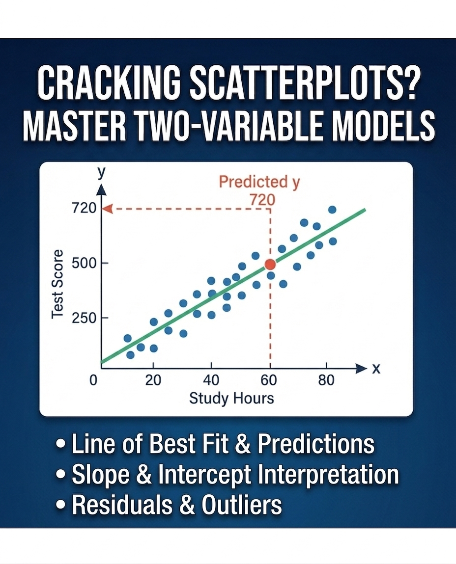
A line of best fit is a line that summarizes the overall linear trend of a scatterplot. It does not need to pass through every point.
What the line is good for
- Estimating a \(y\)-value from an \(x\)-value.
- Describing the overall direction of a linear relationship.
- Interpreting the rate of change through its slope.
- Making predictions when the requested \(x\)-value is within a reasonable range of the data.
8. Using a Model to Predict
If a line of best fit is given, a prediction means finding the point on the line corresponding to the requested \(x\)-value.
9. Slope and Its Meaning
For a line, slope measures the change in \(y\) for each one-unit increase in \(x\).
Positive slope
As \(x\) increases, the predicted \(y\) increases.
Negative slope
As \(x\) increases, the predicted \(y\) decreases.
Context matters
Suppose a model for a plant’s height \(H\), in centimeters, after \(t\) weeks is \[ H=18+2.5t. \] The slope \(2.5\) means the model predicts an increase of 2.5 centimeters per week.
10. The y-Intercept and Its Meaning
A linear model is often written as \[ y=mx+b. \] Here, \(b\) is the \(y\)-intercept: the model’s predicted \(y\)-value when \(x=0\).
Slope \(m\)
How much the predicted \(y\) changes when \(x\) increases by 1.
Intercept \(b\)
The predicted \(y\)-value when \(x=0\).
11. Residuals
A residual measures the vertical difference between an actual observed value and the value predicted by the model.
Positive residual
Actual \(y\) is above predicted \(y\).
Negative residual
Actual \(y\) is below predicted \(y\).
12. Residual Plots
A residual plot places \(x\) on the horizontal axis and residuals on the vertical axis. It helps us judge whether a linear model is a reasonable summary of the data.
Good linear-model signal
Residuals are scattered around zero without a clear systematic shape.
Warning signal
A curved or systematic pattern in the residuals suggests the straight-line model is missing structure.
13. Correlation Is Not Causation
A scatterplot can show that two variables are associated. That does not automatically prove that one variable causes the other.
Three different ideas
Association
The variables tend to move together in some pattern.
Prediction
One variable can be used to estimate the other with a model.
Causation
A change in one variable actually produces a change in the other.
14. Outliers and Influential Points
An outlier is a point that is unusually far from the overall pattern. It deserves attention because it may affect a model substantially.
Vertical outlier
The point is far above or below the general trend at its \(x\)-value.
Influential point
A point can strongly affect the fitted line, especially when it is far toward an extreme of the \(x\)-values.
15. Interpolation vs. Extrapolation
Interpolation
Predicting within the range of \(x\)-values represented by the data.
Usually saferExtrapolation
Predicting outside the observed \(x\)-range.
Use caution16. Scatterplots in SAT Word Problems
Context questions often hide a very simple graph question inside a story. Strip away the story and identify what the axes and model are saying.
Step 1
Identify the \(x\)-variable and its units.
Step 2
Identify the \(y\)-variable and its units.
Step 3
Determine whether the question asks about points, trend, slope, or prediction.
Example
A scatterplot compares weekly practice time \(x\), in hours, with a measured performance score \(y\). A line of best fit is \[ y=62+4.5x. \]
Question
What does the \(4.5\) mean in this context?
Interpretation: According to the model, each additional hour of practice is associated with an increase of about 4.5 points in the predicted score.
17. Interpreting a Regression Equation
When a problem gives a linear model \[ y=mx+b, \] every part of the equation has a job.
| Part | Mathematical meaning | Context question |
|---|---|---|
| \(m\) | Change in predicted \(y\) for a 1-unit increase in \(x\) | How quickly does the predicted response change? |
| \(b\) | Predicted \(y\) when \(x=0\) | What does the model predict at zero? |
| \(y\) | Predicted response | What quantity are we estimating? |
| \(x\) | Input/explanatory variable | What quantity are we using to make the prediction? |
18. SAT Traps You Should Recognize Instantly
The question asks for the predicted value, but you read the nearest actual data point. Fix: follow the line of best fit.
You calculate predicted minus actual instead of actual minus predicted. Fix: remember \( \text{residual}=\text{actual}-\text{predicted} \).
The slope describes the rate of change. The intercept is the predicted \(y\)-value at \(x=0\).
Strong describes tightness; positive or negative describes direction.
A scatterplot can show association and support prediction, but it does not by itself establish a causal relationship.
A prediction far outside the observed \(x\)-range may be much less reliable.
A slope of \(3\) could mean 3 dollars per hour, 3 centimeters per week, or something entirely different. The units come from the variables.
19. SAT Decision Framework
Use this six-step scan before calculating
1. Axes
What are \(x\) and \(y\)? What are their units?
2. Pattern
Positive, negative, none? Linear or curved?
3. Strength
Are the points tightly clustered around a trend?
4. Model
Is a line of best fit or equation provided?
5. Question
Prediction, slope, intercept, residual, or comparison?
6. Range
Is the requested prediction interpolation or extrapolation?
Most scatterplot questions become much shorter once you identify exactly what the graph is being asked to tell you.
20. Quick Concept Check
Answer: Positive.
Answer: The predicted change in \(y\) for a 1-unit increase in \(x\).
Answer: Negative.
Answer: Interpolation.
Answer: No.
21. Advanced Practice
These problems deliberately emphasize the visual reasoning that appears repeatedly in SAT two-variable-data questions: choosing an equation from a graph, reading a prediction from a best-fit line, finding slope or average rate of change, comparing actual and predicted values, counting observations above a model, selecting an appropriate model shape, transforming a model, and interpreting the model in context. All numbers, contexts, and visuals below are original.
The scatterplot shows the relationship between \(x\) and \(y\). A line of best fit is shown. Which equation best represents the line of best fit?
Choose two points whose coordinates are easy to read. Here, the two convenient points are
\[ (x_1,y_1)=(0,8.5),\qquad (x_2,y_2)=(5,6). \]
Find the slope:
\[ m=\frac{y_2-y_1}{x_2-x_1} =\frac{6-8.5}{5-0} =\frac{-2.5}{5} =-0.5. \]
Since \(y=8.5\) when \(x=0\), the \(y\)-intercept is \(b=8.5\). Using \(y=mx+b\),
\[ \boxed{y=8.5-0.5x}. \]
Because the line crosses the \(y\)-axis at about \(8.5\), we immediately know \(b=8.5\).
Now choose a second clear point on the line, \((5,6)\), and calculate
\[ m=\frac{6-8.5}{5-0}=-0.5. \]
Therefore \(y=mx+b\) becomes
\[ \boxed{y=8.5-0.5x}. \]
This can be the fastest SAT method when the choices are simple. Pick easy points from the graph and see which equation matches them.
At \(x=0\), the graph gives \(y\approx8.5\). This eliminates C and D because both have \(y\)-intercept \(3.5\).
Now test \(x=10\). The graph gives \(y\approx3.5\).
A gives \(8.5-0.5(10)=3.5\) ✓
B gives \(8.5+0.5(10)=13.5\) ✗
So A is the only equation that matches the graph.
A line of best fit is shown. Which value is closest to the predicted y-value when \(x=7\)?
At x = 7, follow the model line. It is near y = 9.
The line of best fit is shown. Which is closest to the slope of the line?
First choose two points that are easy to read on the line. The two highlighted points are excellent choices. Reading the grid gives
\[ (x_1,y_1)=(2,4),\qquad (x_2,y_2)=(8,10). \]
Now calculate the slope:
\[ m=\frac{y_2-y_1}{x_2-x_1} =\frac{10-4}{8-2} =\frac{6}{6} =1. \]
Therefore the answer is B) \(1\).
At \(x=6\), what is the difference between the actual \(y\)-value and the \(y\)-value predicted by the line of best fit?
8.1 – 6.9 = 1.2. The actual value is 1.2 units above the prediction.
For how many of the 10 data points is the actual y-value greater than the y-value predicted by the line of best fit?
A point above the line has actual y greater than predicted y. There are 6 such points.
The scatterplot shows an increasing pattern that becomes steeper as x increases. Which type of model is most appropriate?
The pattern curves upward and becomes steeper, so an increasing nonlinear model is the best match.
A line of best fit is \(y=4+1.5x\). Every y-coordinate is then multiplied by 2. Which equation could represent the transformed line?
Multiplying every y-value by 2 multiplies both parts of the model: y = 2(4 + 1.5x) = 8 + 3x.
The line of best fit models ice cream sales S, in dollars, as a function of temperature t, in degrees Celsius. The model is \(S=30t+120\). Which statement best interprets the slope?
The coefficient of t is the slope, so the model predicts about $30 more in sales for each 1°C increase.
According to the plotted data, what is the average rate of change in temperature from \(x=3\) minutes to \(x=7\) minutes?
The highlighted points are approximately (3,10) and (7,18). The average rate is (18 – 10)/(7 – 3) = 2°C per minute.
The line of best fit is shown. Which labeled point has the greatest positive residual?
A positive residual means actual minus predicted is positive, so the point is above the line. Point C is farthest above it.
The observed study times range from 1 hour to 9 hours. A student uses the line of best fit to predict the score at 11 hours. What type of prediction is this?
The requested x-value, 11, is outside the observed range 1 to 9, so the prediction is an extrapolation.
A scatterplot shows travel time versus distance. What does the line of best fit predict for the travel time when the distance is \(8\) kilometers?
First identify the variables. The horizontal \(x\)-axis shows distance in kilometers, and the vertical \(y\)-axis shows travel time in minutes.
Find \(8\) on the distance axis. Move vertically until you reach the line of best fit, then read the corresponding value on the travel-time axis. The line is at approximately \(28.5\) minutes.
Thus, the predicted travel time is
\[ \boxed{28.5\text{ minutes}}. \]
If the displayed line is represented by the equation
\[ y=4.5+3x, \]
then \(x\) represents distance and \(y\) represents predicted travel time. Substituting \(x=8\):
\[ y=4.5+3(8)=4.5+24=28.5. \]
This confirms the value read from the graph.
Final SAT Scatterplot Checklist
Read the axes first. Then identify the direction and shape. If a line of best fit is shown, distinguish an observed value from the value predicted by the line.
For equation questions, read the sign and approximate size of the slope and the y-intercept. For prediction questions, follow the model line or substitute into the model equation. For context questions, keep the units attached to the slope and prediction.